
Striped Wallpaper Ideas: Fresh, Modern Ways to Use Stripes
Striped Wallpaper Is Back, And It's More Versatile Than You Think. Stripes have never really gone anywhere. They just went quiet for a while, hiding behind the linen textures and limewash finishes that dominated the last few years. But they're back now, properly back, and the version showing up in 2026 interiors is a lot more interesting than the classic Farrow & Ball two-tone you might be picturing.
Whether you want something calm and architectural or something with a bit more swagger, there is a stripe for it. Here are some striped wallpaper ideas to help you work out which one is right for your room.

The subtle striped wallpaper idea
Thin, tonal stripes, where the contrast between colours is low, thin, tonal stripes are one of the most underrated striped wallpaper ideas going. They read almost like a texture from a distance, adding depth and structure to a wall without drawing attention to themselves.
This is the stripe for people who say they are not a stripe person. It works beautifully in bedrooms, nurseries, kids rooms and living rooms, particularly in soft neutrals, warm whites, dusty blues and sage greens. It gives a room a quietly tailored feel, the kind that makes guests ask what you did to make the space feel so pulled together, even though they cannot quite put their finger on it.
Pair it with unfinished linens, wooden furniture, and warm lighting. It sits particularly well alongside botanical prints if you want to mix patterns, the stripe acts as a calming anchor.


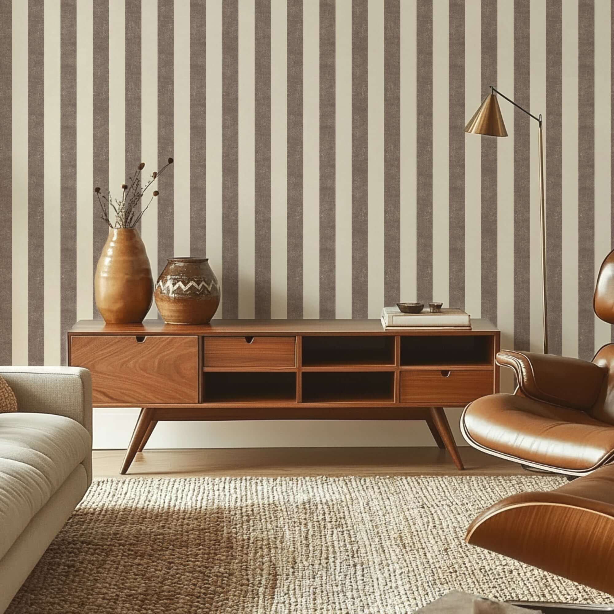
The bold stripe
A wider, higher-contrast stripe is a different thing entirely. It is confident, a little retro, and surprisingly flattering to a room when used well.
The key is placement. A bold stripe on all four walls of a large room risks feeling like a changing room cubicle. But on a single feature wall, behind a bed, at the end of a hallway, or framing a fireplace breast, it becomes a proper focal point. It earns its place.
Colour is everything here. The 2026 versions moving through interiors right now lean into warm, earthy tones: terracotta and cream, deep teal and off-white, ochre and dusty rose. Less graphic, more characterful. Less 1990s, more considered.
If you are someone who tends to play it safe and then quietly regrets it, this is the one to try on a smaller wall first. You may surprise yourself.

How stripes can reshape a room
Stripes do something useful that other patterns do not: they change how a room feels spatially.
Vertical stripes draw the eye upward, making ceilings feel higher. This is particularly effective in older houses with lower ceilings, or in rooms where you want to add a sense of grandeur without structural work.
Horizontal stripes push the eye sideways, making narrow rooms feel wider. Used carefully in a hallway or a box room, they can genuinely alter how the space reads.
This is not a trick or an illusion exactly, it is just how the eye moves. Worth knowing before you choose your direction.


Striped wallpaper ideas for unexpected places
People tend to think of striped wallpaper as a living room or bedroom option. But some of the nicest applications are more unexpected:
A downstairs loo. Small, rarely photographed, and therefore the perfect place to be bold. A dark, dramatic stripe in a tiny space works in a way it might not in a room you have to live in all day.
A hallway. The first thing you see when you come home, and often the last room to be thought about. A strong vertical stripe here sets a tone for the whole house.
A home office or study. Stripes have a certain purposeful energy to them. They are not a distracted pattern. A quietly striped wall behind a desk tends to feel calm rather than busy, good for a space where you need to think.

Getting the scale right
As with any pattern, the scale of a stripe needs to suit the room. In a small space, very wide stripes can feel oppressive; very narrow stripes can get lost. A medium width, somewhere between a fine pinstripe and a broad band, tends to be the most versatile.
Always order a sample and hold it against your wall in the actual room, in both natural and artificial light. A stripe that looks neutral on screen can read quite differently depending on which direction your windows face. North-facing rooms, in particular, can make cool tones feel colder than expected.

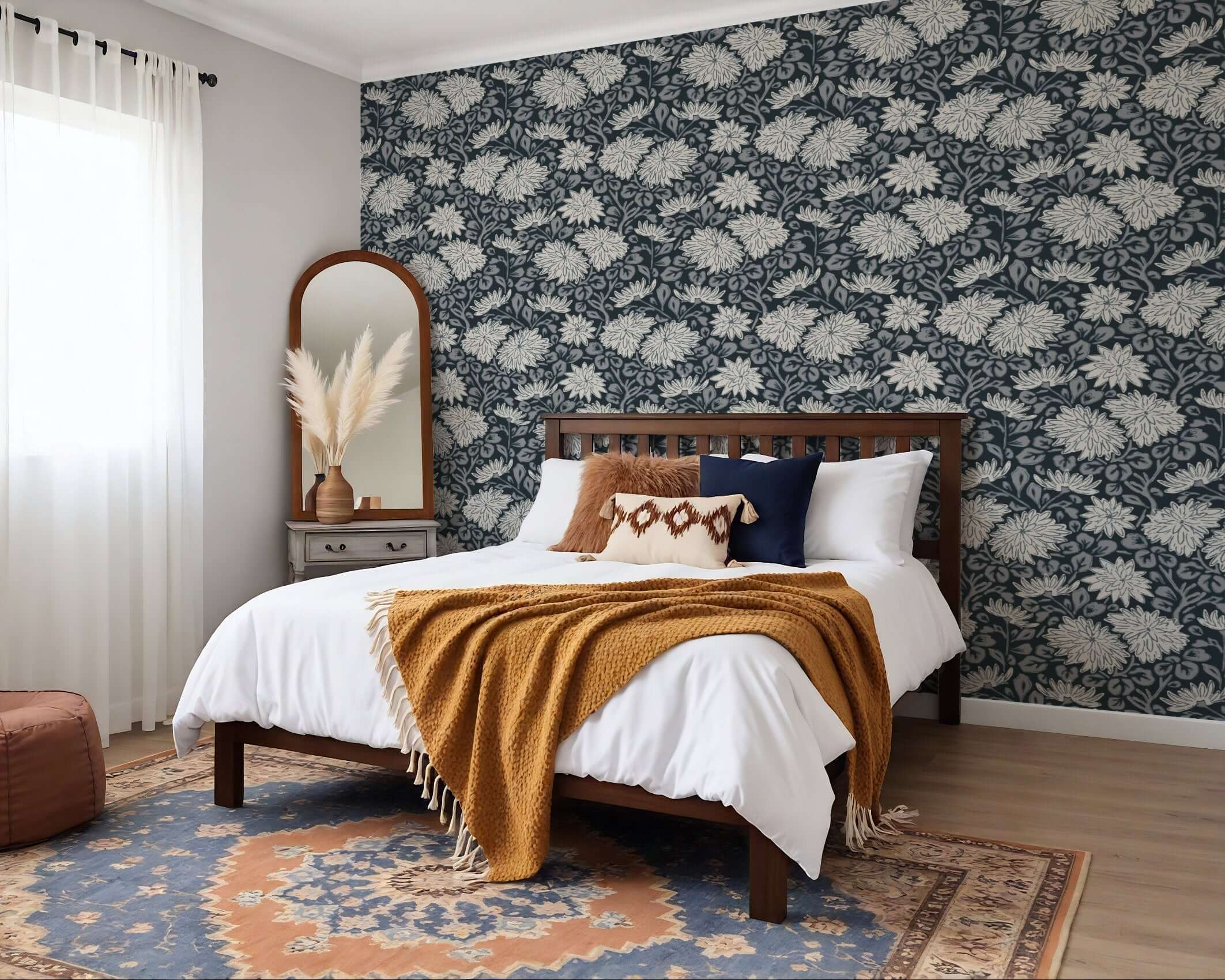
Mixing stripes with other patterns
The current mood in interiors is layered rather than matched, which means stripes are mixing well with other prints in ways that would have felt chaotic five years ago.
The rule of thumb: keep a shared colour running through both patterns. A stripe in sage and cream alongside a botanical in similar greens will feel considered rather than busy. It is the colour that holds the room together, not the pattern.
Stripes and checks work together for the same reason, they are both structured patterns, and they share an underlying geometry that feels harmonious rather than competing.


Striped wallpaper ideas with wall panelling & waincoating.
If you have been noticing a lot of rooms lately where the lower portion of the wall is painted or panelled and the upper half is wallpapered, that is dado panelling, named after the dado rail, the horizontal moulding that sits roughly a metre from the floor and divides the two zones.
It is having a real moment, and stripes are one of the best patterns to use in this treatment. Here is why: the dado rail creates a natural boundary that gives a bold stripe somewhere to stop. Instead of running floor to ceiling, which can feel like a lot, the stripe sits in the upper half of the wall, framed by the rail below. It looks intentional and considered rather than brave and slightly anxious.
The most common approach is to paint the lower section in a solid colour, usually a shade pulled from the stripe itself, and wallpaper above the rail. A deep navy stripe above a navy-painted dado, for instance, reads as sophisticated rather than overwhelming. Terracotta and cream works well in the same way. So does a muted sage green paired with a tonal stripe in similar greens.
You can also reverse it: wallpaper below the rail, plain paint above. This is slightly less common but can work well in rooms where you want the pattern low and grounded, a dining room, for example, where the walls are mostly seen at seated height.
Dado panelling adds genuine architectural interest to a room that has none, which is useful if you live somewhere without original period features. It makes flat, builder-beige walls feel as though they were designed rather than just painted.


If these striped wallpaper ideas have got you thinking, you can browse the full striped wallpaper collection here. Samples are available if you want to test one in your space before committing.
Summer Skye Studio makes original surface patterns for wallpaper and home textiles, designed and printed to order.
Written by Sara Cooper
Leave a comment
This site is protected by hCaptcha and the hCaptcha Privacy Policy and Terms of Service apply.