
Article: Wallpaper Pattern Scale – Why Size Really Matters
Wallpaper Pattern Scale – Why Size Really Matters
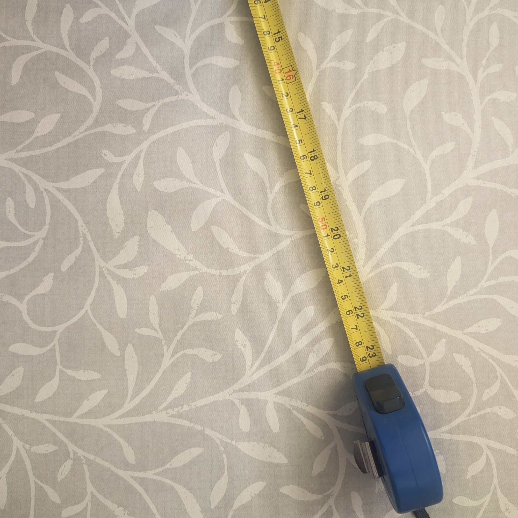
Wallpaper pattern scale is one of those quiet details that can make or break a room, and it's the thing that catches most people out. Falling in love with a design online is easy. Then the sample arrives, you hold it up to the wall, and you're thinking, "wait, why does this look nothing like I pictured?" Nine times out of ten, the scale caught you off guard.
Here's a big part of why: on a screen, you're looking at a pattern zoomed out, taking in the whole design at once. In real life, a single motif can be far bigger than you clocked. So the leaf that looked delicate on your phone turns out to be the size of your hand on the wall. Once you understand scale, that surprise stops happening. Let's break it down.

What wallpaper pattern scale actually means
In plain terms, wallpaper pattern scale is how large the motifs appear once they're on your wall. The leaves, the florals, the geometrics, whatever your design happens to be.
Same pattern, different scale, completely different feel. Picture a leafy design where each leaf is the size of your palm, then picture the exact same pattern with leaves the size of your fingernail. Identical design, totally different impact on the room. That's scale doing its quiet work.

Large-scale pattern wallpaper: where it shines
Large-scale patterns love spacious rooms: living areas, open-plan spaces, stairwells. They bring energy and drama, and they're brilliant for a feature wall that needs to lead the way, especially when there's minimal furniture and the wallpaper gets to be the star.
To give you a sense of how deliberate this is, take my Art Deco Peacock. My wallpaper panels are 30 inches wide, and because I wanted that design to feel bold and unapologetic, I sized it so you get two peacocks across a panel. That's roughly fifteen inches a bird, which is a genuinely large scale, and it's what brings that Gatsby drama to life in a big room. In a small room, that same scale can easily overwhelm, unless bold and dramatic is exactly what you're after, which can absolutely work if it feels right to you.

Small-scale pattern wallpaper: where it works
Smaller motifs are made for cosy spots: cloakrooms, pantries, alcoves. They give you all-over coverage without shouting, and they're lovely for layering with other patterns or textures.
Scale can also change what a pattern even reads as. My pinstripe is a good example. I drew each stripe at about a third of an inch, so fine that from across the room it stops looking like a stripe at all and reads as a soft texture, the colours almost blending together. That's a deliberate small-scale choice. The flip side: in a big, open room with high ceilings, a very small pattern can sometimes disappear into the walls, so it's worth picturing it from a distance too.

The bit most guides miss: the scale you see isn't fixed
Here's the part hardly anyone realises. The scale you see on any design is a decision the designer made for a certain effect. It's a starting point, not a fixed rule. And with my designs, you can change it.
Think about that peacock again. Someone came to me wanting it for a narrow hallway panel rather than a feature wall. At the standard scale, she'd have got one or two peacocks stranded on that strip, which looks awkward. She wanted three or four to sit nicely, so I simply scaled it down for her. Same design, better fit. That's the trick most scale advice never mentions: if the repeat isn't sitting right for your wall, the answer often isn't a different design, it's a different scale of the same one.
And your eye matters more than any rule here. I design each pattern with a view in mind, but my view isn't always yours, and that's completely fine. I used to work in housing, where we had a saying that you could send three surveyors to the same house and get three different answers back. Taste is exactly like that. Even seasoned designers say much the same: interior designers openly admit that the right scale can only really be judged standing in the room, not by a rulebook.

How to test scale before you commit
Tape a sample up with masking tape and step back to look at it from across the room, not with your nose against it. Check it at different times of day, because light changes how a pattern reads more than people expect. Morning light and evening light can make the same scale feel like two different things.
Most importantly, trust your gut. If it feels wrong, it probably is. If it makes you smile every time you walk past, you've nailed it. If you'd like more help weighing it all up, my guide on how to choose the right wallpaper pattern goes further.

Can I change the scale of my designs?
Yes, within reason, and it's free. Just tell me whether you'd like a design in the standard scale (as shown), larger, or smaller, and I'll adjust it. It's a quick tweak on my end, and it means you can make a pattern fit your room rather than squeezing your room around the pattern. If you're not sure what would suit, send me a photo of your space and I'm happy to help you judge it.
Need something more specific, like a precise percentage change or a proper redesign? That's a bigger job, so just ask me for a scale request and we'll work it out together.
Final thoughts
Scale is personal. There are no strict rules, just what feels right for your space and how you want to live in it. So order that sample, tape it up, and don't be afraid to experiment. And if a design is almost right but the scale feels off, don't assume it's not for you. It's genuinely always worth asking, because more often than not, I can make it fit. If you're weighing up more than scale, my guide on how to choose wallpaper walks through the rest.

Written by Sara Cooper

Leave a comment
This site is protected by hCaptcha and the hCaptcha Privacy Policy and Terms of Service apply.