
Is Geometric Wallpaper in Style? An Honest Answer from the Designer
You've found a geometric pattern you like, it's nearly in the basket, and then the doubt arrives: is geometric wallpaper in style, or is this going to look dated in three years?
Short answer, no, it won't date. Geometric wallpaper isn't really a style, it's a shape. Circles, squares, rectangles, diamonds, arches, checks. Shapes don't go in and out of fashion, because the eye has always been drawn to shape and symmetry. What dates is the colour it's printed in, and that's the part you get to choose.
Here's the longer version, including the bit where the designer surveys say something slightly different.

Why geometric wallpaper doesn't really date
Geometric is one of those words that sounds specific and isn't. It covers almost anything built from a repeating shape. My own geometric wallpaper collection has arches, circles, squares, rectangles, sunbursts, plaids and checks in it. That's not a style. That's a category of shape.
And shapes don't expire. A circle was a circle in 1925, in 1965 and this morning. You can't change a circle. You can only reimagine it, through scale, through rhythm, through the colours you put it in.
Plaid is a good example. It's stripes laid over the top of each other, which makes it a geometric even though most people would file it under country cottage. Striped wallpaper is the most geometric thing there is, a straight line repeated, and nobody seriously worries that stripes are about to go out.
There's a reason these patterns keep coming back. Symmetry and repetition are restful to look at. The eye follows a rhythm without having to work at it.

What about geometric wallpaper trends for 2026?
This is where I'll be straight with you, because there is a number that seems to say the opposite.
The 1stDibs Interior Designer Trends Survey asked 468 design professionals what they expected for 2026. Geometric patterns slid to 10%, stripes to 9%, and floral and botanical motifs came out on top at 22%.
So geometrics have slipped in professional preference. That's true and I'm not going to pretend otherwise.
But it's worth noticing that stripes slipped in the same survey, and stripes are not going anywhere. What a designer specifies for a client project this year and what looks right on your wall for the next decade are two different questions. Professional preference moves fast because it has to. Your hallway doesn't.
What has genuinely shifted is the execution. Older geometrics tend towards strict symmetry, the tight grid, the exact repeat. Newer ones are looser and more organic, with hand-drawn edges and a gentle rhythm rather than a rigid one. Both are still geometrics. They just behave differently on a wall. My mid-century designs sit at the structured end. The arches sit at the looser end.

Colour is what dates, not the shape
Here's the thing that actually ages a wall.
Take the same circle and run it through the decades. Bauhaus put it in bright primary red, blue and yellow. The mid-century era took it into browns, mustards, avocado and burnt orange. Today it tends to land in muted tones, warm neutrals and soft pastels.
Same shape every time. Completely different room.
And the palette keeps moving. The same survey has burgundy jumping from 7% to 21%, butter yellow more than doubling from 14% to 30%, and designers predicting an earthy, dramatic 2026 led by deep browns, greens and reds.
Which is exactly the point. If colour is the thing that moves, then colour is the thing to think hard about, and the shape can look after itself.

How do you choose a colourway you'll still like?
I get asked this a lot, and I use the same three steps every time.
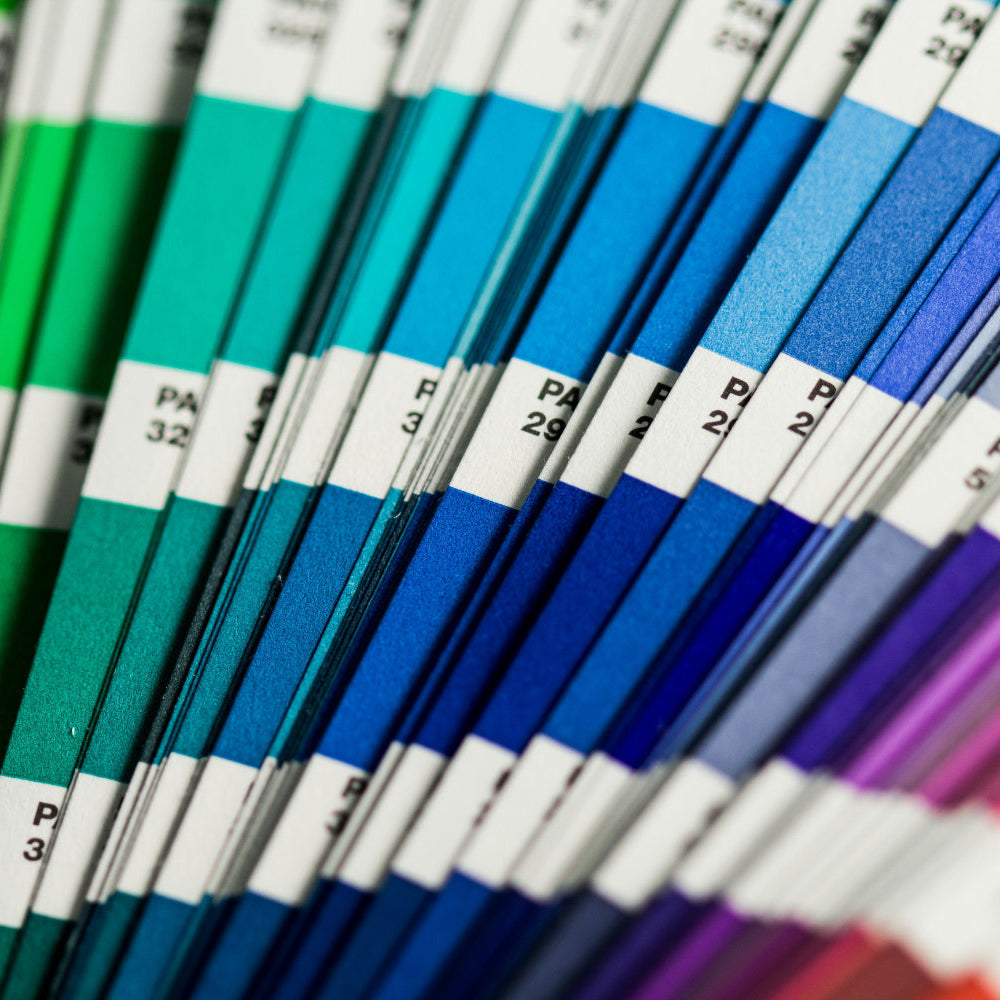
Start with your favourite colour. People have been answering this question since primary school. You already know yours. Mine are the warm ones. There's no cleverness required here, just honesty.
Then decide how much of it you want. Within any colour there's a whole range: bold and rich, dark and moody, light and airy, or soft and muted. This is usually where people get stuck, because they've picked green and then realised there are forty greens.
Then let the room break the tie. What is it for? A nursery you want calm in points you towards muted, pastel or lighter shades. A downstairs loo can go as bold as you like, because nobody has ever settled in for a long soak in a downstairs loo. A teenager's room that wants to feel like a cave can take dark browns and blacks quite happily.
Every design in the collection comes in several colourways, so once you know the answer to those three questions the shortlist gets short quickly. And if the colour you want isn't there, every design can be recoloured for free. Send me your paint code and I'll adjust the artwork before it prints.

Does scale change how geometric wallpaper feels?
Enormously. Scale and tone are the two dials, and most people only think about one of them.
The same circle pattern at a small scale reads as texture. At a large scale it reads as a statement. Nothing about the design has changed except how big it is.
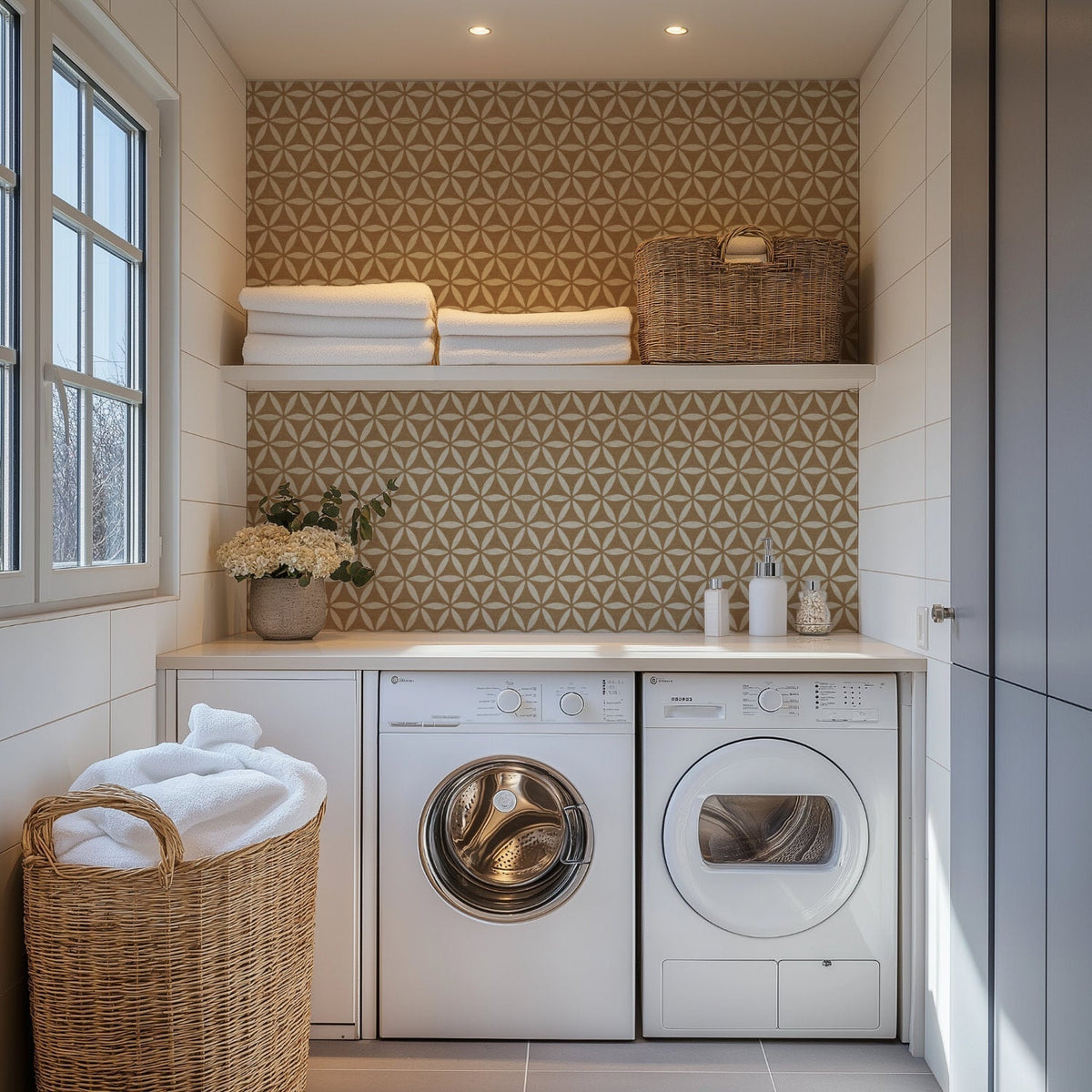
If you want something quiet, go smaller scale and stay in muted tones. Arches wallpaper is the one I'd point you at first. It only comes in soft colours, and it isn't strictly symmetrical, so it has a gentle rhythm rather than a hard grid. Sacred Geometric does something similar, a flower of life circle pattern that goes back centuries and still sits calmly on a wall.

If you want the room to actually do something, go large. Retro Square was designed to be big and bold, and it doesn't do subtle.
There's more on getting this right in my guide to wallpaper pattern scale. Basic scaling is free too, so if a pattern is right but the size isn't, that's a conversation, not a dead end.
Can you use geometric wallpaper instead of tiles?
This is one of the more interesting things happening with geometrics at the moment. People are using them where tiles would traditionally go, in kitchens and bathrooms, because a repeating geometric already does what tile does visually. Retro Tile is literally a stadium pill shape, and it reads as tile from across the room.
The appeal is obvious. No grouting, no wet trim, no tile saw.
But there are real limits, and they're the same limits a bathroom has.
You still need a proper splashback, or backsplash if you're in the US, behind anything wet. That thin row of tiles above the worktop, or the panel behind the basin, does the actual waterproofing. You wouldn't leave bare paint behind a sink either. Wallpaper goes above that line, not instead of it.
Behind a hob is a no. Heat will work at the edges over time, and peel & stick in particular won't thank you for it.
But the run of wall between the cupboards where you chop, or the bit above the splashback line, or a breakfast nook wall, all of that is fair game.

On material, pre-pasted and peel & stick both suit moderately humid rooms including bathrooms, though neither should be in direct contact with water. Peel & stick is the one I'd lean towards for a busy bathroom. There's a fuller comparison in my guide to traditional and peel & stick wallpaper. Traditional is for dry rooms only, so it's a no for bathrooms whatever the pattern.
How do you make sure it works in your room?
Order a sample and live with it for a bit.
I know how that sounds coming from the person selling the wallpaper, so let me explain why it's the answer.
The product photos are as accurate as I can make them. What I can't know is your room. I don't know how much light it gets, which direction it faces, what colour your floor is, or how big your walls are. A pattern that looks perfectly balanced on a screen can read differently once it's up against your particular light and your particular skirting.
A customer ordered a sample recently, put it on the wall, and came back to say the scale felt a bit large for the room. Could I reduce it? Of course. That took one message. Had she skipped the sample and ordered full rolls, it would have been an expensive way to find out.
That isn't a mistake. That's due diligence working exactly as intended. Sticking a sample on the wall for a week and walking past it a hundred times tells you more than any amount of scrolling.
You don't need it to be wrong. You just need it to be right.

So, is geometric wallpaper in style?
It's a shape, so it's evergreen. What moves is the palette, and you're in charge of that.
Pick the colour you actually love, decide how deep you want it, let the room settle any argument, and then check it on your wall before you commit.
If you're torn between two colourways, or you want something in a colour that isn't listed, just drop me a line. That's what the customisation is there for.

Written by Sara Cooper

Leave a comment
This site is protected by hCaptcha and the hCaptcha Privacy Policy and Terms of Service apply.