
Article: Pink Bedroom Wallpaper Ideas for Grown-Up Rooms
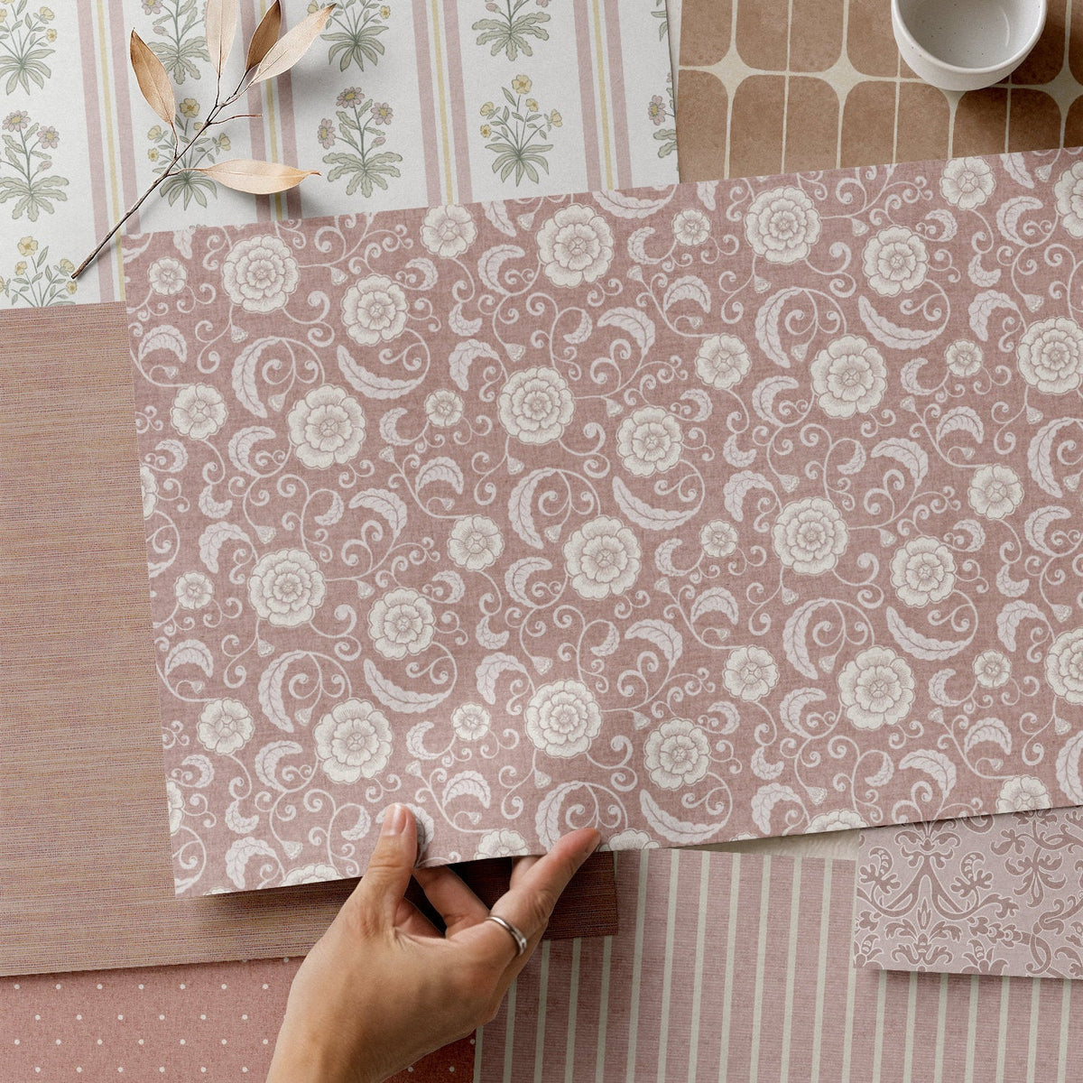
Pink Bedroom Wallpaper Ideas for Grown-Up Rooms
Before I share my pink bedroom wallpaper ideas, I'll be honest with you from the start: pink has never really been my colour. I was a bit of a rebel as a child and steered well clear of it, which probably explains why, now that I design wallpaper for a living, my pinks have all turned out dusty, muted and soft round the edges. So if you're drawn to pink for your bedroom but worried it'll feel a little too sugary for a grown-up, I think we're on the same page.
What I've found is that a grown-up pink bedroom comes down to three things: the shade, the pattern, and what you put with it. Get those right and pink becomes one of the warmest, most flattering colours you can live with. Below are my pink bedroom wallpaper ideas, from the shades I'd choose to where I'd hang it, and if you'd like to see the designs first, every one of them is in my pink wallpaper collection.

Is Pink a Good Colour for a Bedroom?
In my experience, yes, as long as you choose the right pink for you. The pinks that sit most comfortably in a grown-up bedroom are the ones with a bit of grey, brown or clay mixed in, because those undertones calm the colour down and let it behave more like a warm neutral. Graham & Brown have named Rose Earth, a dusty pink with muted brown undertones, as their colour of the year for 2027, and Ideal Home's round-up of the 2027 colour trends shows just how much of that earthy pink is around at the moment.
Pink is also kind to a bedroom in a practical sense. It's flattering in the grey light of a winter morning and in the warm glow of a bedside lamp, and a soft pink is the sort of colour people often describe as calming, which makes a lot of sense for a room you mostly use at either end of the day.
Which Shades of Pink Work in a Grown-Up Bedroom?
Blush pink
Blush is the lightest of the warm pinks, just a hint of colour on the wall, and it's lovely with white or oatmeal bedding and pale wood. If you're dipping a toe in, this is the one I'd start with.
Dusty and dusky pink
This is my home turf. Dusty pink has a touch of grey in it, which takes the sweetness out and gives it a slightly vintage, lived-in feel. My pinstripe comes in a soft dusty pink, and it's the one I'd put in my own bedroom, but more on that below.
Light and pale pink
Pale pink sits so close to neutral that it works almost anywhere, including on a ceiling, which I'll come back to. It's worth ordering a sample for this one in particular, because pale colours shift a lot with the light, and a pink that looks soft on screen can look quite different in a north-facing room.
Deeper rose and burgundy pinks
I do have one brighter pink in the range, which is my Rectangular wallpaper in pink and burgundy. It's a bold, staggered block design, and it's the one I'd reach for if you want an accent wall that makes a statement. Deep pinks and burgundy together feel rich and grown-up, a bit like a good velvet cushion.

Pink Bedroom Wallpaper Ideas by Pattern
Damask for a classic grown-up feel
If you want a pink bedroom that feels grown-up the moment you walk in, a damask does it. My Victorian Damask is hand-drawn, with all the classical scrolls you'd expect, and putting a design with that much history in a dusty pink gives the room a real sense of maturity. Damask started life as a woven fabric long before it made its way onto walls, and I think that's part of why it feels so at home in a bedroom. I'll be honest, I probably wouldn't use it in my own room, as I'm a stripe girl at heart, but of all my pinks it's the one that says grown-up the loudest.

Pinstripe and soft stripes
For me personally, it would be the pinstripe. It isn't a heavy stripe, it's more of a textural one, which means it gives the walls some interest and then quietly lets everything else in the room do the talking. That's what I love about it in a bedroom, because you can pile on the plush pillows, throws and blankets, change them with the seasons, and move the furniture around, and the walls will go along with whatever you decide.

Florals
Florals and pink go together naturally, so the trick in a grown-up bedroom is choosing a floral with a looser, more sketchy hand, or one with plenty of green in it. My Dahlia is a hand-drawn, sketchy floral that a lot of people fall for in pink, although not everyone in the house always agrees. I had a lovely message on Etsy recently from a customer who loved the pink dahlia, but her husband didn't want pink, so she asked whether I could do it in blue or green. That's exactly what free colour customisation is for: you send me the colour you'd like, I recolour the design and send you a digital preview, and you decide from there. There's more on how it works in What Is Custom Wallpaper?

Small repeats
A small repeat, like a polka dot on a dusty pink ground, gives you pattern at a gentle volume, and it's a good choice for a smaller bedroom or a sloping ceiling where a big design might feel crowded.

Which Wall Should You Wallpaper in a Bedroom?
It really depends on what you want to look at first thing in the morning.
If you want to go all in, colour drenching is a big theme in interiors at the moment, and some grown-ups really do want the full pink experience. In that case I'd wrap the whole room, walls and all, so the pink surrounds you and the room feels cosy and complete.
The other option, and the one I see most often, is an accent wall behind the bed. This is where you can afford to be a bit louder with your pattern or colour, and I like it for a very practical reason: if it's behind the bed, it's not the first thing you see when you open your eyes, so you get a chance to wake up properly before the big, bold stuff.
Ceilings are having a moment too. One idea I've been playing with is moodier walls with a light pink paper on the ceiling, which, in my thinking, could lift the room and give it a feeling of a bit more height. I'd love to hear from anyone who tries it.
What Colours Go With Pink Wallpaper in a Bedroom?
Pink and green
Pink and green has been popular for a good while now. It came through strongly with the preppy look, and it's one of the main pairings in cottagecore and grandmillennial rooms too. Pink is really a lighter red, and red and green sit opposite each other on the colour wheel, which is why the two balance each other so well: you get the warmth of the pink and the freshness of the green. It's also where the paint brands are heading, because four of the big 2027 colours of the year are greens, which I've rounded up in my colour of the year 2027 post.

Pink and grey
My personal favourite is grey. I love a bit of grey, but that's just me. A soft, warm grey alongside a dusty pink gives you a calm, contemporary bedroom, and it's an easy pairing to live with because both colours shift gently through the day.
Pink and blue
A soft grey-blue with a warm pink is a gentle, grown-up combination, and Valspar's 2027 colour, Cottage Door, is styled with exactly that: a muted blue with an apricot pink and a warm grey. Navy works too if you want more contrast, especially with a paler pink.
Pink with warm neutrals and wood
Oatmeal, stone and off-white let a dusty or blush pink settle in, and natural wood, cane and linen bring out its warmth. A brass lamp or two adds a bit of polish. If your walls have a lot of pattern, I'd keep the bed and the bigger furniture fairly simple, so the room feels pulled together.
What Paint Goes With Pink Wallpaper?
For woodwork, skirting boards and door frames, a warm white or a soft cream is the safe and lovely choice, as it frames the pink without competing with it. On the walls you're leaving plain, a sage green such as Dulux's Soulful Sage brings in the pink and green pairing, while a pink like Rose Earth gives you a tone-on-tone look that's halfway to colour drenching.
If you've already got a paint colour you love, it works the other way round too. Send me the paint code and I'll recolour the design to sit alongside it, for free, and you'll get a digital preview before you decide anything.
Choosing the Right Wallpaper for Your Bedroom
All three of my papers work well in a bedroom, so the choice really comes down to how you'd like to hang it.
- Traditional (non-pasted): a paste-the-wall paper with a smooth matte finish. You'll need to buy wallpaper paste separately.
- Pre-pasted: the paste is already on the back, so you activate it with water using a sponge or roller, and you can reposition it while it's still wet.
- Peel and stick: no paste at all, and you can reposition it for up to 24 hours after hanging, which makes it a popular choice for renters. Walls vary, though, so I'd always test a sample on your own wall first.
If you're torn, my honest guide to traditional wallpaper vs peel and stick goes into the detail. And if you're ordering more than one roll, order them together, as colour can vary slightly between print runs.
Finding Your Grown-Up Pink
Whether you go all in with a full pink wrap or keep your pink bedroom wallpaper to a quiet stripe behind the bed, I'd always start with a sample, so you can see the pink in your own light, morning and evening, before you commit. My free guide, Buy Wallpaper with Confidence, walks you through it. And if you've spotted a design you love but the pink isn't quite right, or someone in your house has vetoed pink altogether, just drop me a message. There's no such thing as a silly question, and I'm always happy to help.

Written by Sara Cooper


Leave a comment
This site is protected by hCaptcha and the hCaptcha Privacy Policy and Terms of Service apply.